Health and safety are undeniably critical components of any hospital or healthcare facility. However, many may overlook how even the most seemingly ordinary attributes can play a significant role in these areas. Consider paint, it’s vital in shaping a hospital’s environment. Beyond appearance, the right paint used in hospitals can actively enhance safety measures and foster a more inviting atmosphere. From specialised coatings that promote cleanliness to colour choices that aid in wayfinding and traffic flow, paint serves multiple functions in a hospital setting. Consider how thoughtful paint selection can improve hygiene and pathfinding, reduce slip hazards, and improve cognitive engagement.
Elevating Hygiene Standards
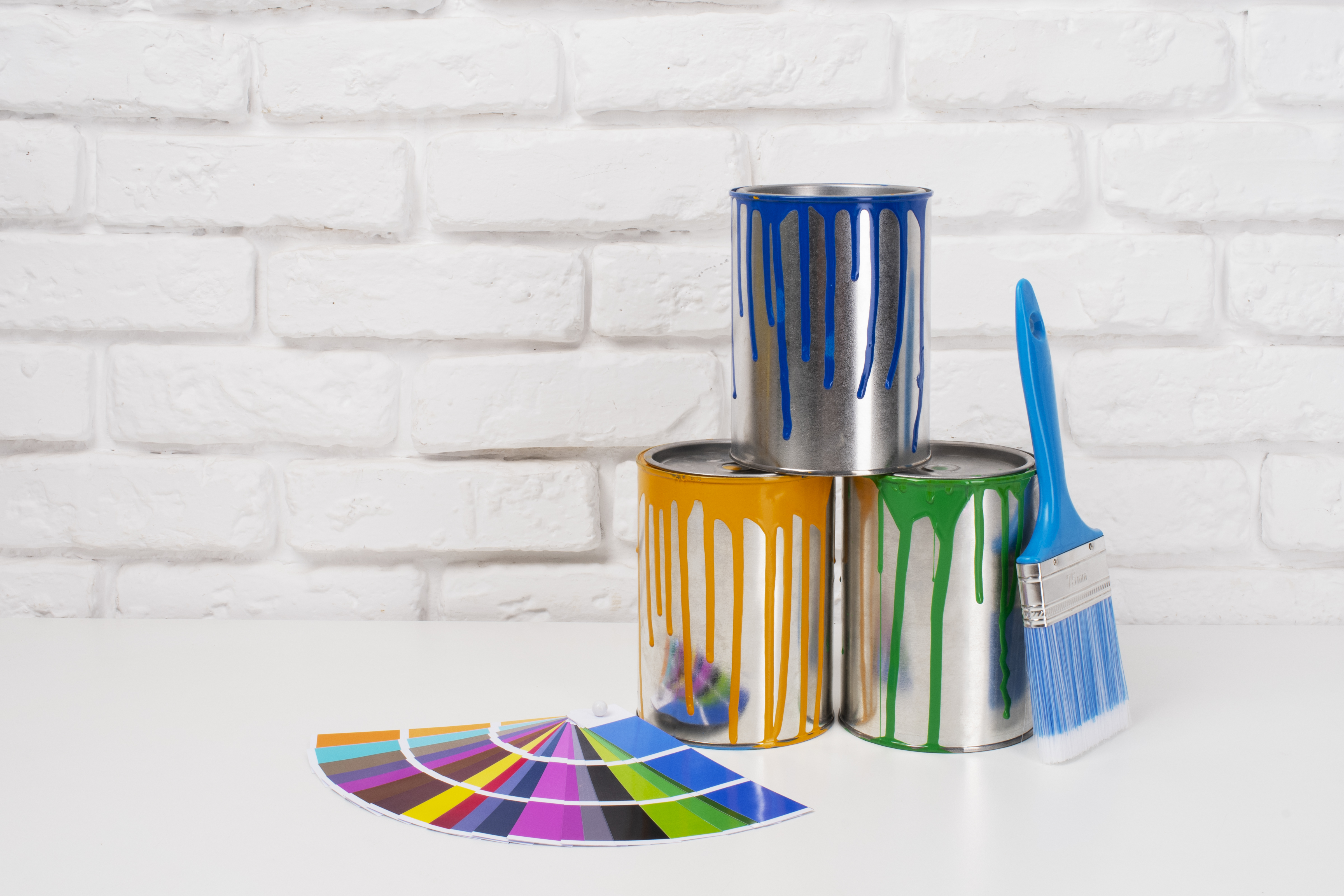
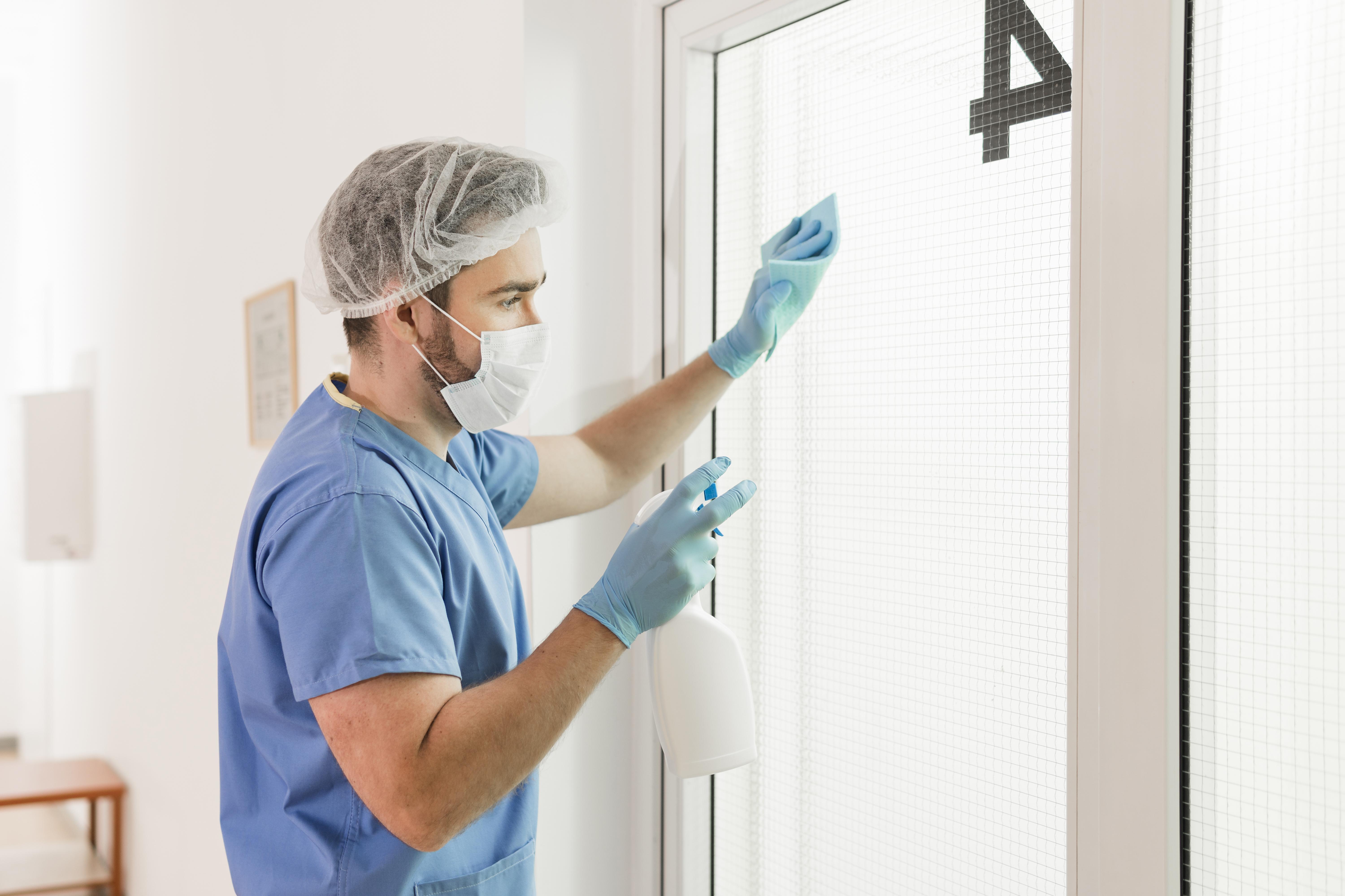
Hygiene is a foundational element of healthcare. With the constant threat of healthcare-associated infections, selecting the best paint for hospitals is crucial. Antimicrobial paints are specifically designed to inhibit the growth of bacteria and fungi on surfaces. These paints contain active ingredients that restrain microbial proliferation, ideal for high-touch areas such as patient rooms, waiting areas, and corridors.
Moreover, the right paint can make cleaning more accessible and more effective. Paints with stain-resistant and washable finishes allow frequent cleaning without degrading the surface, ensuring that hygiene standards remain high. Hospitals that invest in high-quality, easy-to-clean paints are committed to maintaining a sanitary space and promoting patient safety and health outcomes.
Streamlining Navigation
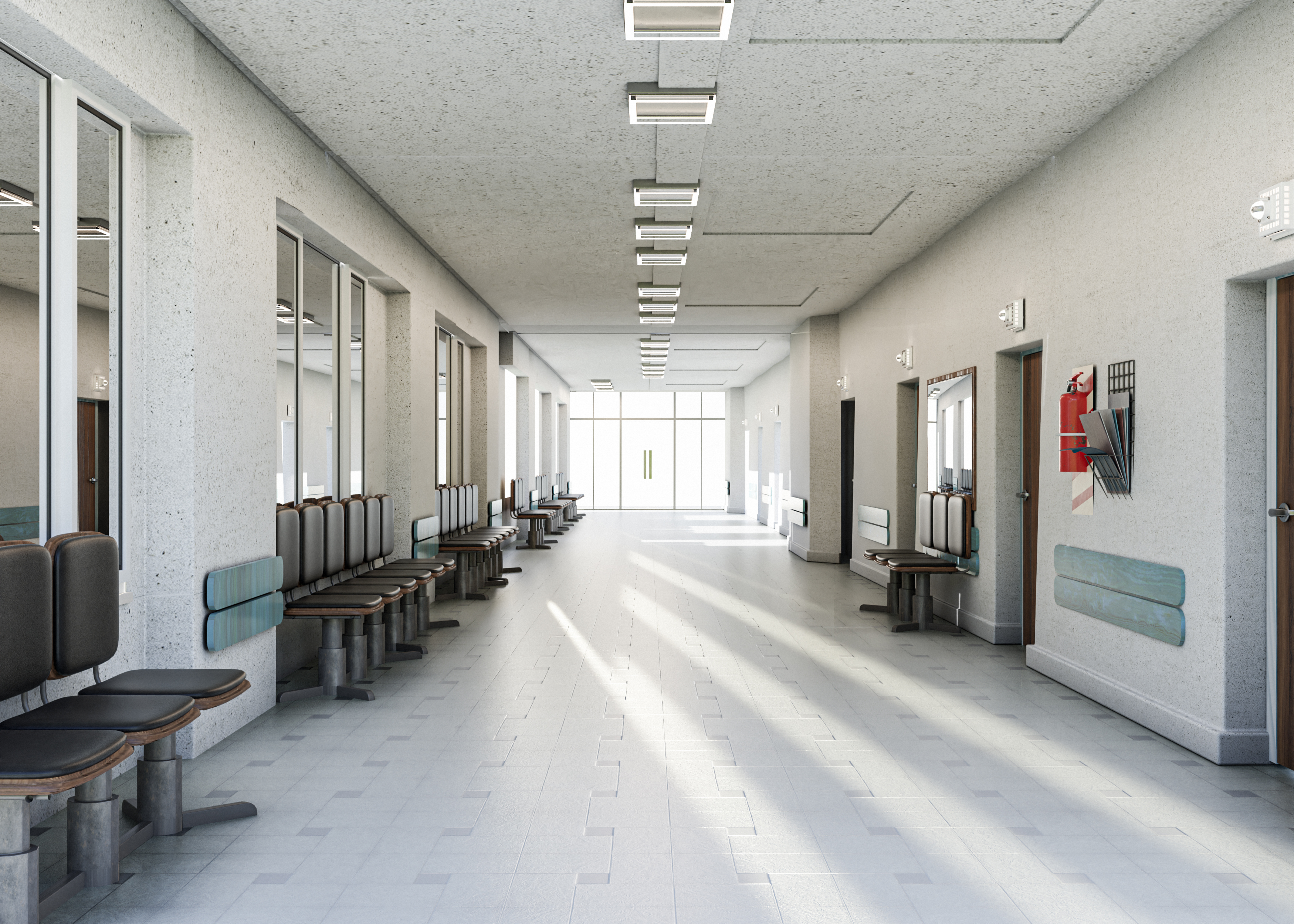
Seamless navigation is essential for both patients and staff in healthcare facilities. Clear visual cues can alleviate confusion, minimise delays, and efficiently guide individuals to their destinations. Strategically used colours can be extremely beneficial. By utilising high-contrast colours for signs and directional markers during hospital painting, healthcare places can have better visibility. Hospitals typically consist of colour-coded visual locations (for example, blue for radiology, red for emergency), arrows directing patients, and symbols, all of which help patients and staff to navigate hospitals and other healthcare facilities quickly and efficiently.
To help patients, as well as staff, locate their way through a healthcare facility, consider using high-contrast colours that helps to increase the visibility of the cues, particularly for the elderly person or in dimly lighted areas. These painted cues help to improve wayfinding in an environment that should minimize, if not eliminate confusion, while also improving the experience for the patient.
For instance, colour-coding different hospital departments or areas simplifies navigation and creates a cohesive space that helps people orient themselves more easily. In emergencies, where every second counts, having well-marked pathways and signage painted in vibrant colours can facilitate quicker response times, ultimately saving lives.
THOUGHTFUL PAINT CHOICES CAN DO MORE THAN BEAUTIFY HOSPITALS—THEY CAN ENHANCE SAFETY, IMPROVE HYGIENE, AND QUICKLY GUIDE PATIENTS.
Minimising Slip Hazards
Slips and falls are a major concern in hospitals and other healthcare facilities. They could cause serious injuries. Paint can play a pivotal role in mitigating these risks.
The finish can also impact safety. Matte or textured finishes are generally less slippery than high-gloss options, which can become hazardous when wet. By prioritising paint choices that emphasise slip resistance, hospitals can enhance overall safety and cut down the likelihood of preventable injuries, making it safer for patients, visitors, and staff alike.
Enhancing Cognitive Engagement
The psychological impact of colour is well-documented.
Different shades can trigger emotional reactions and profoundly affect mental processes. For example, warmer shades like soft yellows and light oranges create an aura of warmth and comfort, while cooler tones such as blues and greens cultivate tranquillity and concentration.
Research indicates that thoughtfully selected colours can improve cognitive function. This could make it easier for patients to process information and communicate effectively with healthcare professionals. Hospitals can cultivate a more supportive setting that facilitates recovery by choosing paint colours that elevate cognitive engagement.
Fostering a Healing Atmosphere
The ambience of a healthcare facility can greatly affect patient health. Incorporating soft, natural hues can create a tranquil atmosphere that helps mitigate stress and anxiety for patients and their families.
Research indicates that environments with undesirable colours such as aggressive reds or dull grey, will increase patient stress and lengthen treatment.
Desirable colours in healthcare environments soften the ambience of spaces and can create calm and reduce anxiety in patients and promote quicker healing. For example, soft blues, greens, and warm neutrals can help create ideal recovery conditions.
Integrating nature-inspired colours for hospital painting can boost healing by mimicking the calming effects of the outdoors. Blues, greens, and earth tones can create a soothing backdrop, helping increase patient comfort and satisfaction. Hospitals can create spaces that foster healing and well-being by considering paint choices' psychological and emotional aspects.
WITH THE RIGHT PAINT CHOICES, HOSPITALS CAN SIGNIFICANTLY REDUCE THE RISK OF SLIPS AND FALLS, ENHANCING SAFETY FOR PATIENTS AND STAFF ALIKE.